a piece of
puzzle peace
a piece of
puzzle piece
a piece of
puzzle piece
a piece of
puzzle piece
a piece of
puzzle piece
\
\
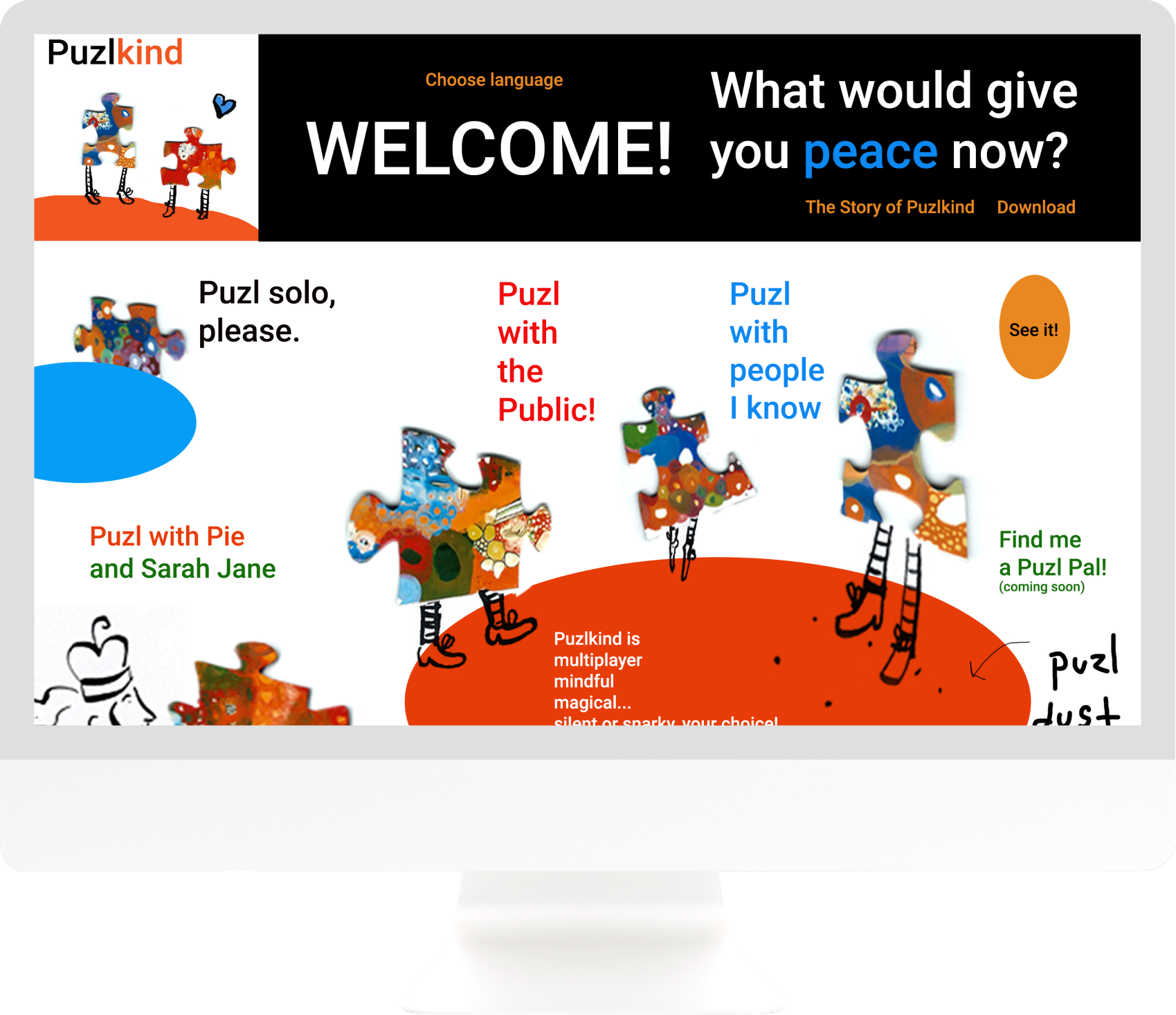
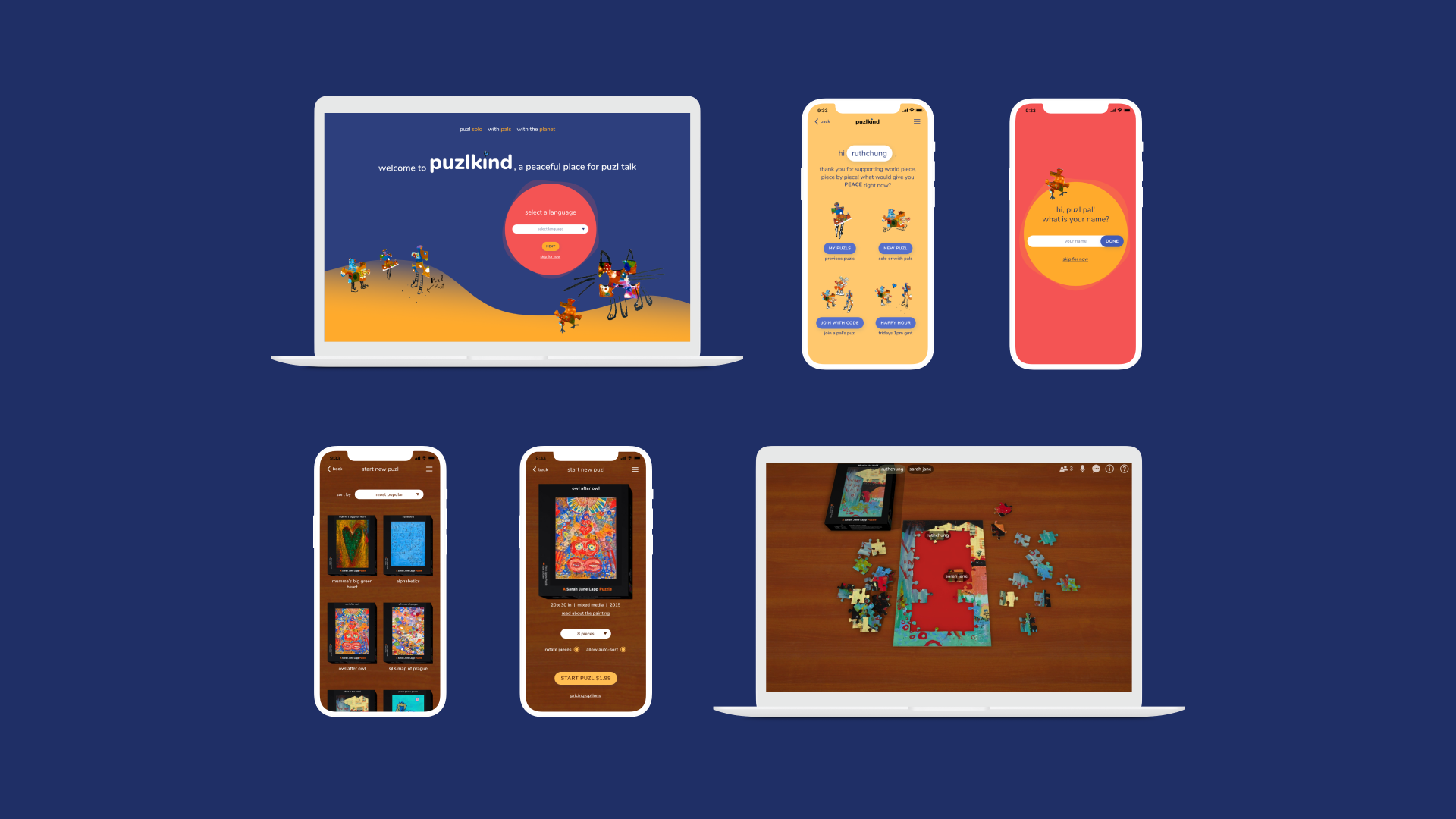
Puzlkind is a digital platform for solo or multiplayer jigsaw puzzl-ing. Created in response to COVID-19 and the days of isolation that ensued around the world, it includes in-game audio and messaging features to lend itself as a unique medium for interpersonal interaction. With its friendly voice and immersive replication of the tactile jigsaw puzzle, Puzlkind is, above all, a meditative and therapeutic experience.
role: product designer
type: desktop\mobile native app
team: puzzle artist sarah jane lapp and engineer mike ferrier
time: 2.5 months. launched feb 2021
context & vision
Sarah Jane, a jigsaw puzzle artist, had hosted regular puzzle happy hours prior to COVID-19, and Mike was a software engineer who frequented these workshops. After COVID-19 hit, Sarah Jane and Mike decided to re-create the happy hours online. Their vision was to:
01 \ recreate the physical jigsaw puzzle experience online
02 \ create a welcoming and therapeutic environment
02 \ create a welcoming and therapeutic environment
03 \ design a multiplayer jigsaw puzzle experience
04 \ promote sarah jane's jigsaw puzzle art
challenge 1/2
unfamiliar context
Once they had a working desktop prototype, Sarah Jane and Mike tried hosting a few workshops with it and found that users needed a lot of guidance navigating the app. This is where Sarah Jane reached out to me.
step 1, understand the problem
observing the design and user feedback, I found the core issue to be that a jigsaw puzzle app is at best an infrequent experience in the first place.
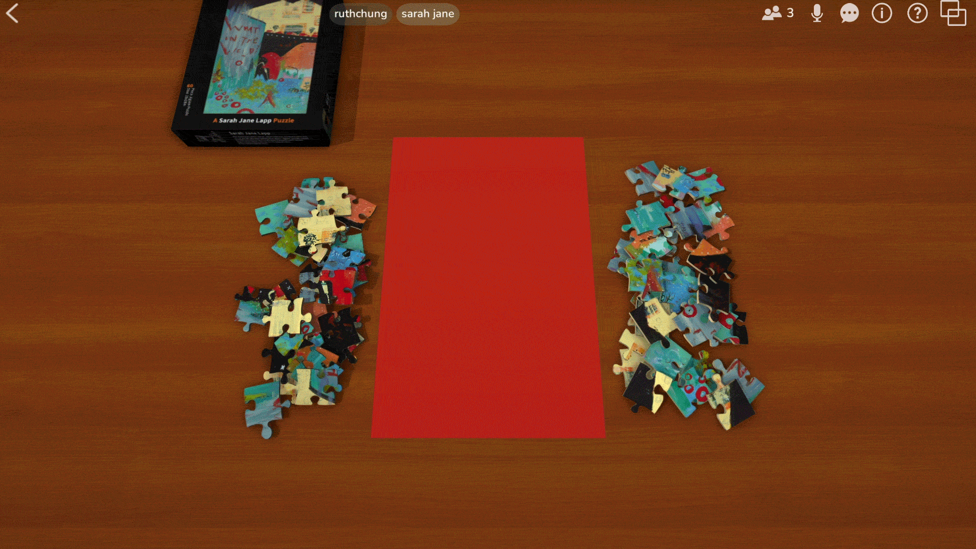
Most of our users were not familiar with online jigsaw puzzles. So when they opened the app not knowing what to expect and landed on this screen (image), users felt overwhelmed by the amount of unfamiliar visual & verbal stimuli.
step 2, define the mission
step 2, define the mission —
how can I design a frictionless journey so that new users can navigate from the home screen to a puzzle game without feeling frustrated?
how can I design a frictionless journey so that users who aren't familiar with digital puzzles can open the app, find their way to the main experience without feeling frustrated?
step 3, hypothesize & experiment
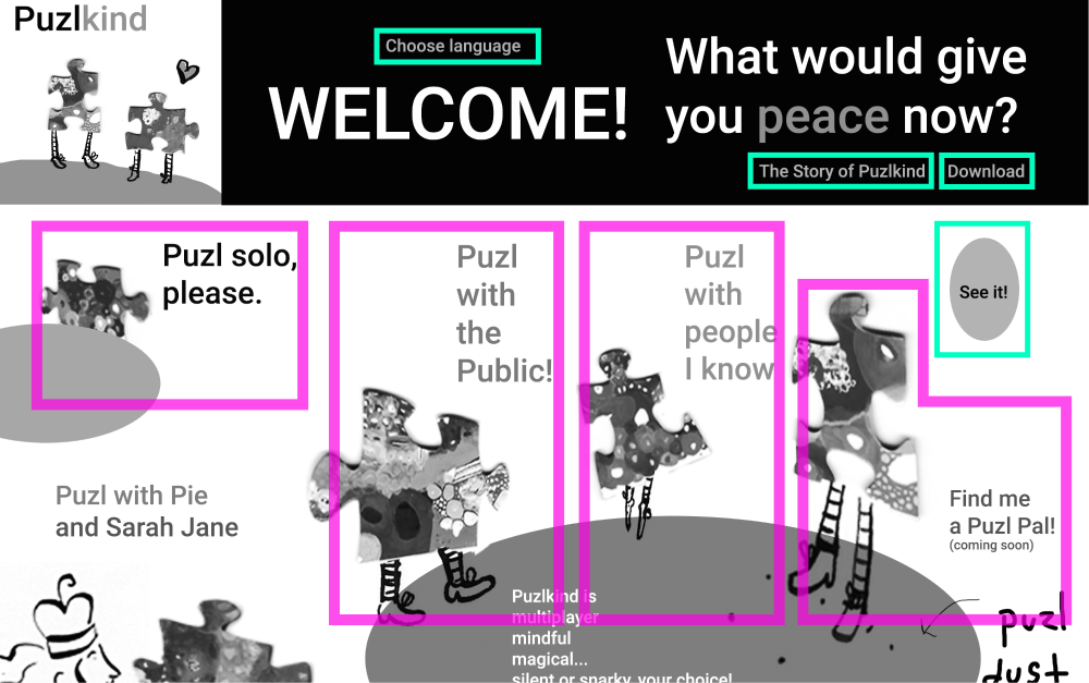
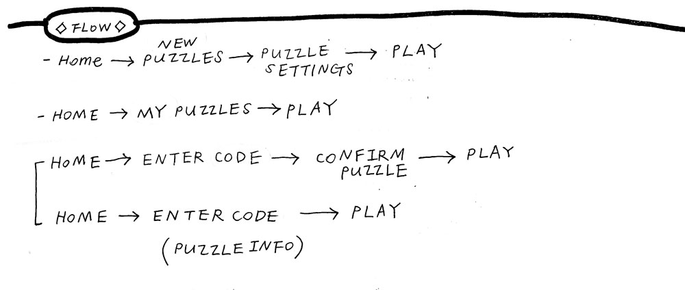
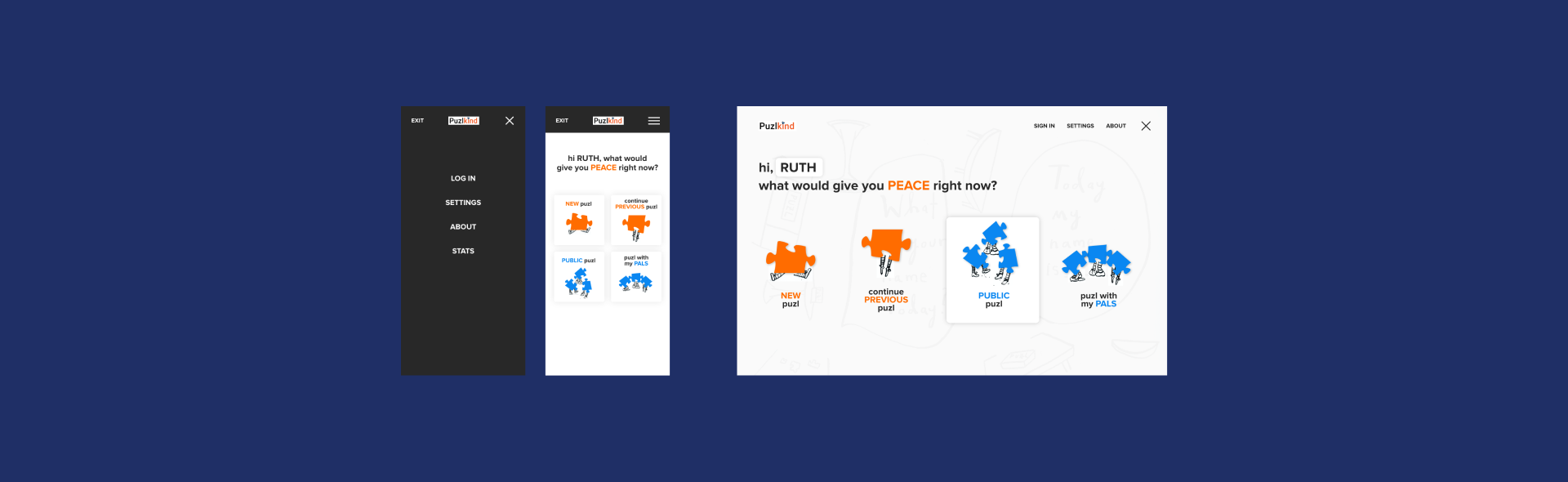
First, I "cleaned up" the interface and identified the "main pathways" and the "ancillary pathways". Then, based on user feedback and my own observations, I identified key personas and brainstormed what each type would expect to find upon opening the app.
Framing question:
"what are users' immediate desires and what are the factors that disrupt them from achieving those goals?"
——
My annotations. Pink outline = main pathway link. Emerald outline = links to an ancillary page (settings/about/etc).
——
My annotations. Pink outline = main pathway link. Emerald outline = links to an ancillary page (settings/about/etc).
——
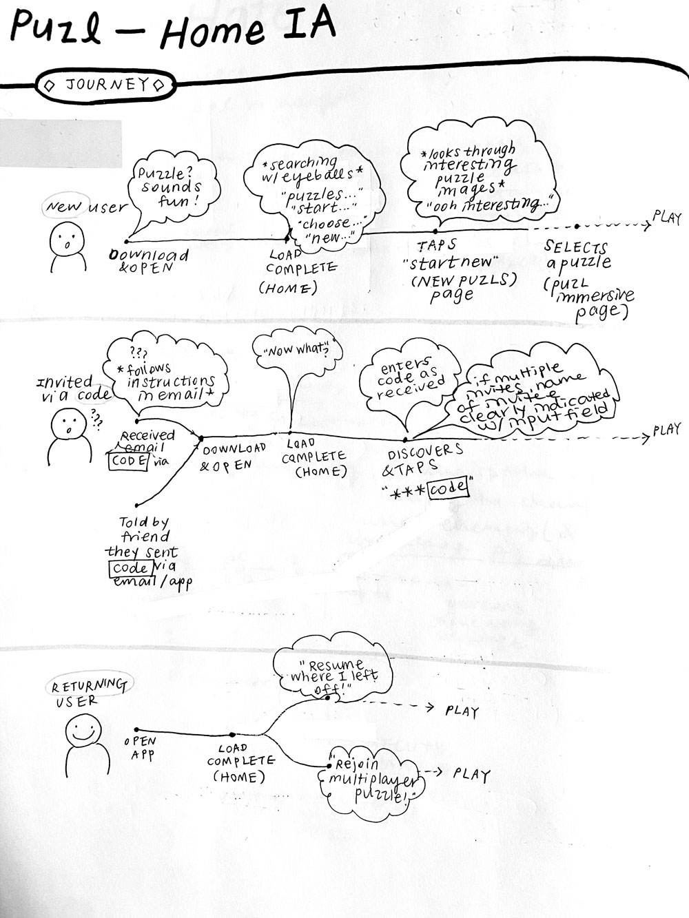
High-level user journey and user flow for a new user, an invited user, and a returning user.
the new user
Immediate desire:
\ "How do I start playing a jigsaw puzzle?"
\ "Where's the menu of jigsaw puzzles?"
\ "Tell me what this app does and what I'm supposed to do"
Disruptive factors:
\ Visual noise
\ Novel words and metaphors
\ CTAs without apparent direction (e.g. buttons, links, menu)
\ Multiplayer puzzle is an unfamiliar concept
the invited user*
Immediate desire:
\ "What am I supposed to do with this code?"
\ "Jenny said she sent an invitation. What does that mean?"
Disruptive factors:
\ No direct reference to "invitation", "joining", or "code"
\ No apparent pathway to any next step
——
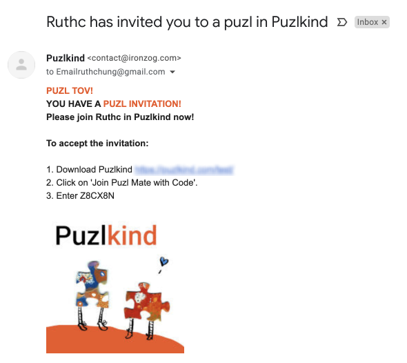
* In Puzlkind, users can invite friends to work on the same jigsaw puzzle together. To invite someone, a user can send a unique alphanumeric code via their friend's email, or send an in-app invitation.
the returning user
Immediate desire:
\ "I want to resume where I left off on my puzzle"
Disruptive factors:
\ No direct reference to resuming a previous puzzle
\ No recognition of user's history
\ No apparent pathway to any next step
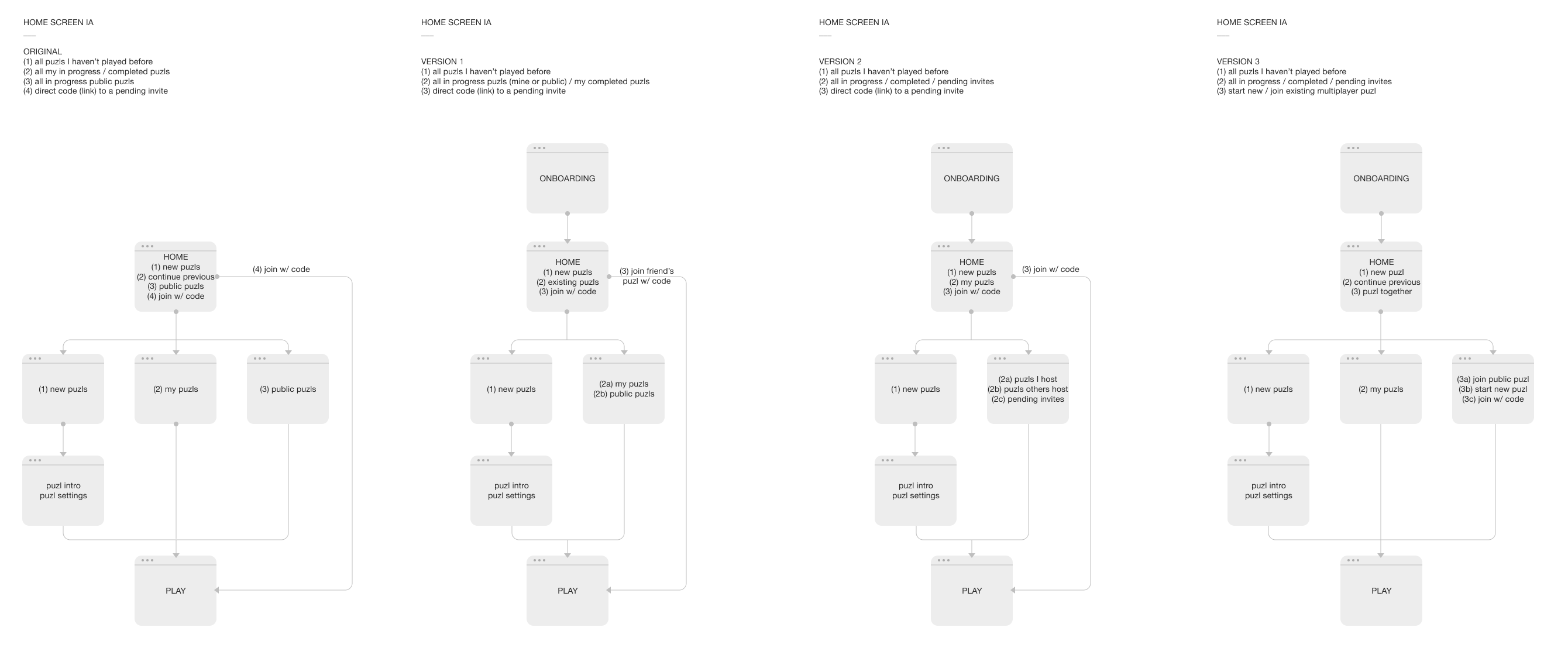
Then, I played around with alternative information architectures and wireframes of the home screen that'd best align with users' mental models.
step 4, prototype
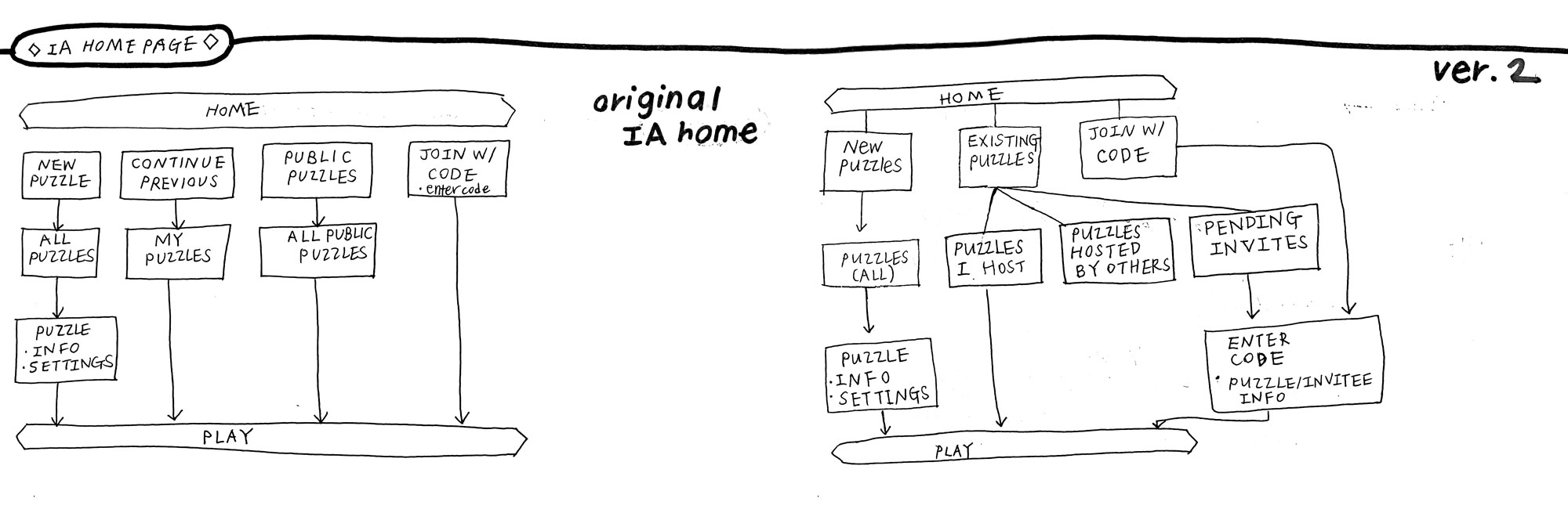
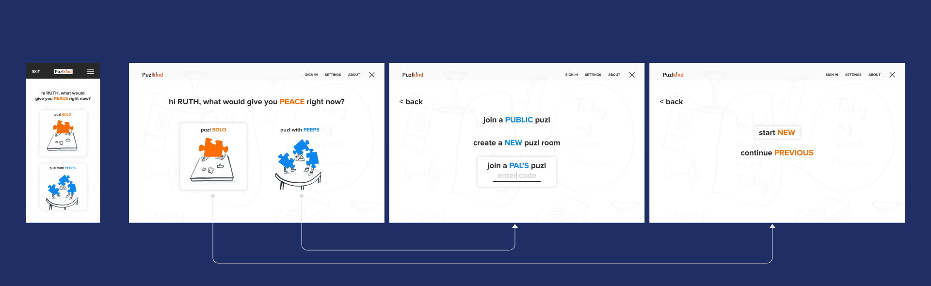
Based on this exercise, I sketched out two revised versions of the home screen. For both versions, I reasoned...
overarching principle
echo, visually and verbally, the objectives of each user.
for the new user —
use familiar words and clear CTA
The experience of a new user is the litmus test for the home screen's usability. This means the home screen needs to be as straightforward as possible, with clear visual cues and languages that don't rely on any context.
\ Color and typography distinguish CTAs from descriptive text, and contain the novel concept of "multiplayer puzzles"
\ Visual noise—Remove or tone down all elements that do not serve the purpose of guiding the user to a main flow.
\ Illustration was a key component to the brand, so I utilized it in a way that added to the above goals.
for the invited user —
let them say "ohhhh" instantly upon entering
The "invite" feature is an inherently vague process to anyone using it for the first time.
\ Invitations sent by email: Make it clear that they have to download and/or launch the app.
\ Invitations sent in-app: Note the sender of the invite that their recipient will see an alert on their app screen.
\ Place a prominent and explicit CTA—"You have an invitation", "I received an invite code"—on the home screen.
for the returning user —
let them operate on muscle memory!
for the returning user —
let them operate on muscle memory!
\ Returning users who want to resume where they had left off are "impatient." Place the words they're looking for ("continue", "previous...") first on the list (top of list on mobile phones) so it's easy to target.
\ Signal that the app recognizes their history by displaying their screen name.
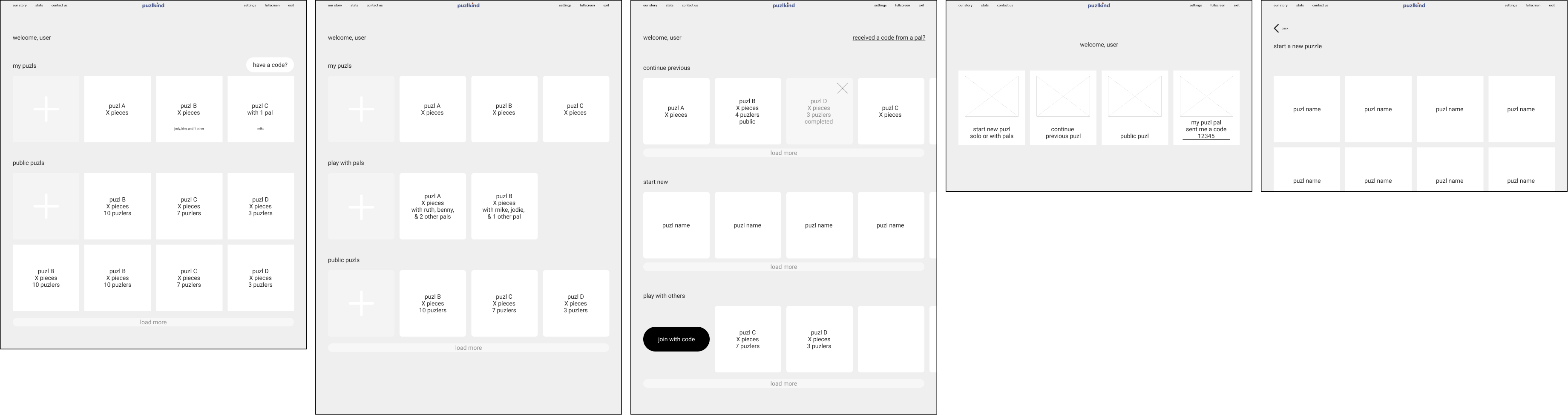
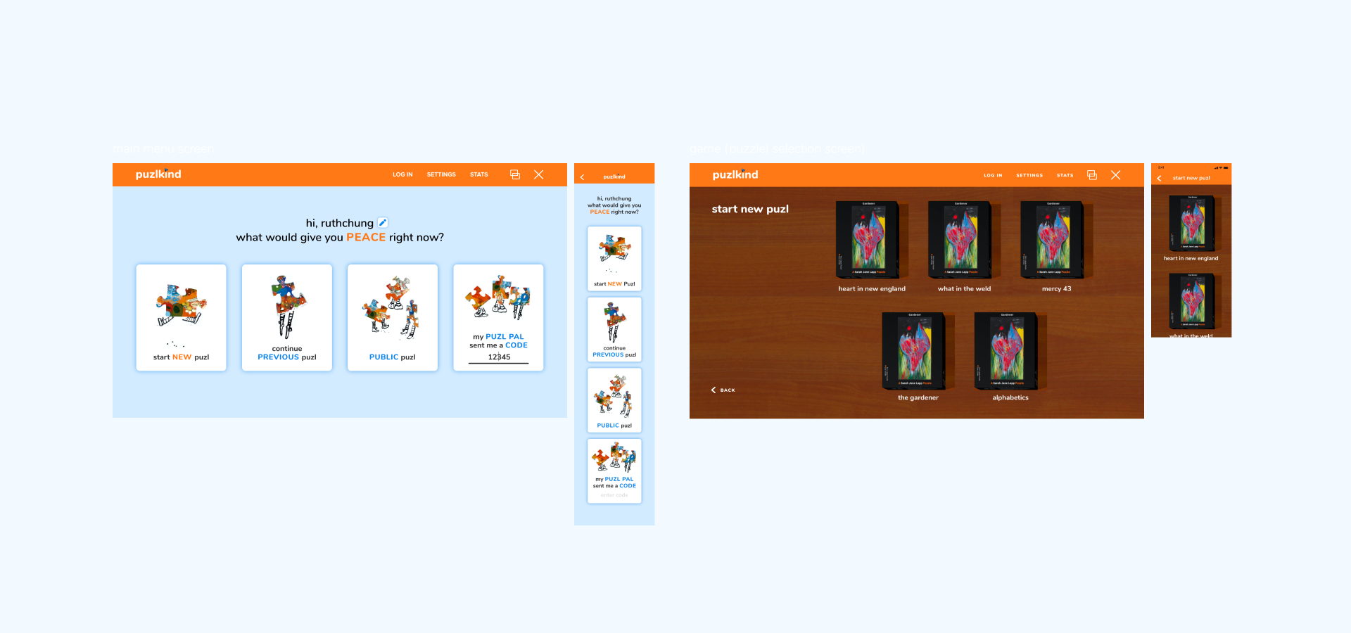
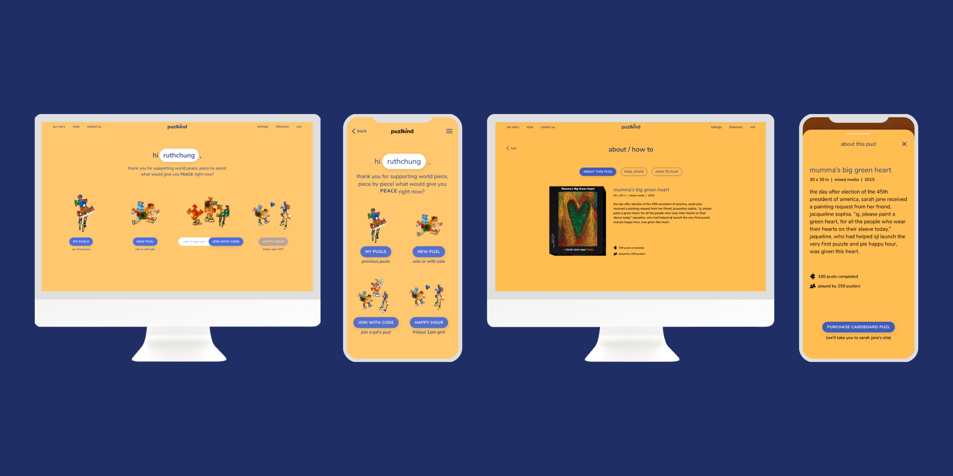
option A
option B—breaking up the steps
email invitation
step 5, testing & drawing a conclusion
Upon user testing with Option A against Option B, which bundled all the multiplayer routes into "puzl TOGETHER" to "contain" the unfamiliar notion of multiplayer puzzles and break it up into more digestible steps, I found that users prefer Option A because:
\ The multiplayer options were clear enough to them
\ They liked having the "received a code" option up front instead of having to click into one layer first
challenge 2/2
applying an elaborate aesthetic
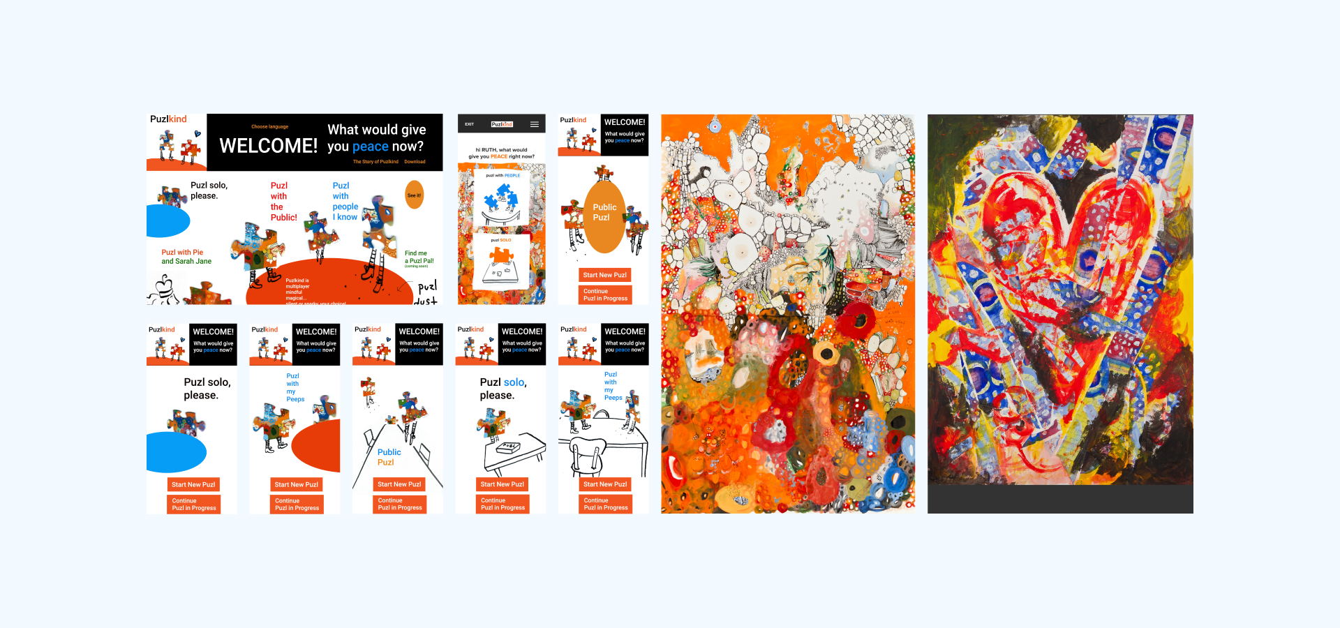
Whereas the main flow UX was on track for improved usability, the app was still in need of a visual system that would maintain the clarity of the high-fidelity wireframes, but honor the particular painterly style of the puzzle artist—after all, Sarah Jane's jigsaw puzzle paintings were one of the key edges Puzlkind held on its competitors.
*pending case study*
From the sketches I was given for look and feel, I established a visual system and made a quick application to the home screen. The goal was to have an MVP ready in a week.
*pending case study*
——
Sarah Jane's paintings and sketches of the app. It was important that the illustration elements were represented in the app.
*pending case study*
——
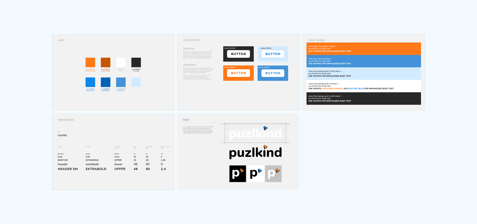
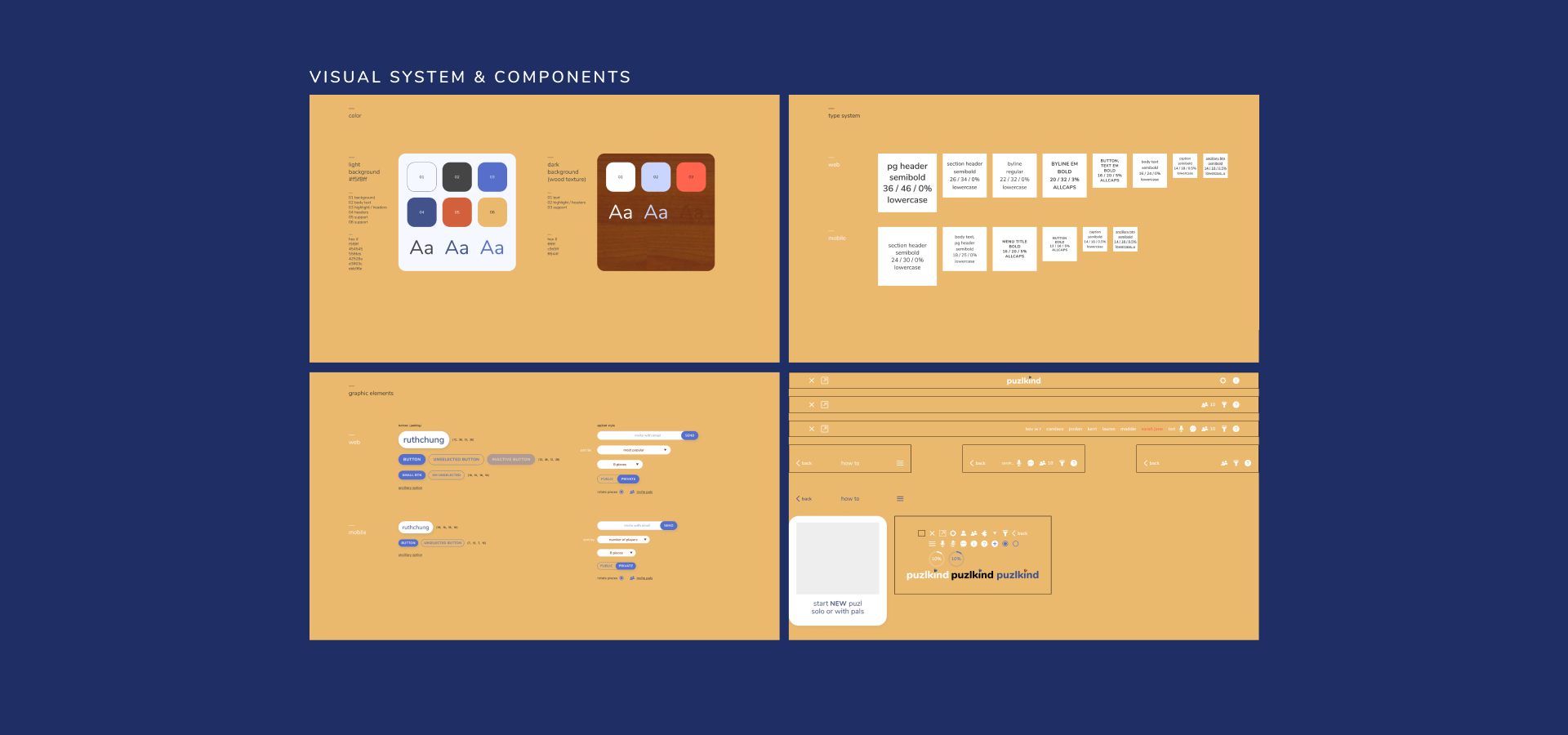
Based on the visual references, I extracted a visual system and applied it to key screens.
*pending case study*
understanding the problem
*pending case study*
It was a fun but tough challenge to incorporate the illustrative look and feel that was asked for, especially when it came to designing for mobile screens. Really observing the exchange between myself and the artist, however, gave me a more intuitive understanding of what was being asked for—
*pending case study*
the mission: design a visual experience that exudes the artist's values and unique tone of voice.
*pending case study*
introducing the onboarding screen(s)
*pending case study*
As of then, users would land on the home screen upon opening the app. It thus made sense that the home screen should set the desired first impression, but this was challenging because the home screen's primary goal was to display uncluttered direction to information. This set me off to map a valence journey to figure out how to apply visual design strategically.
*pending case study*
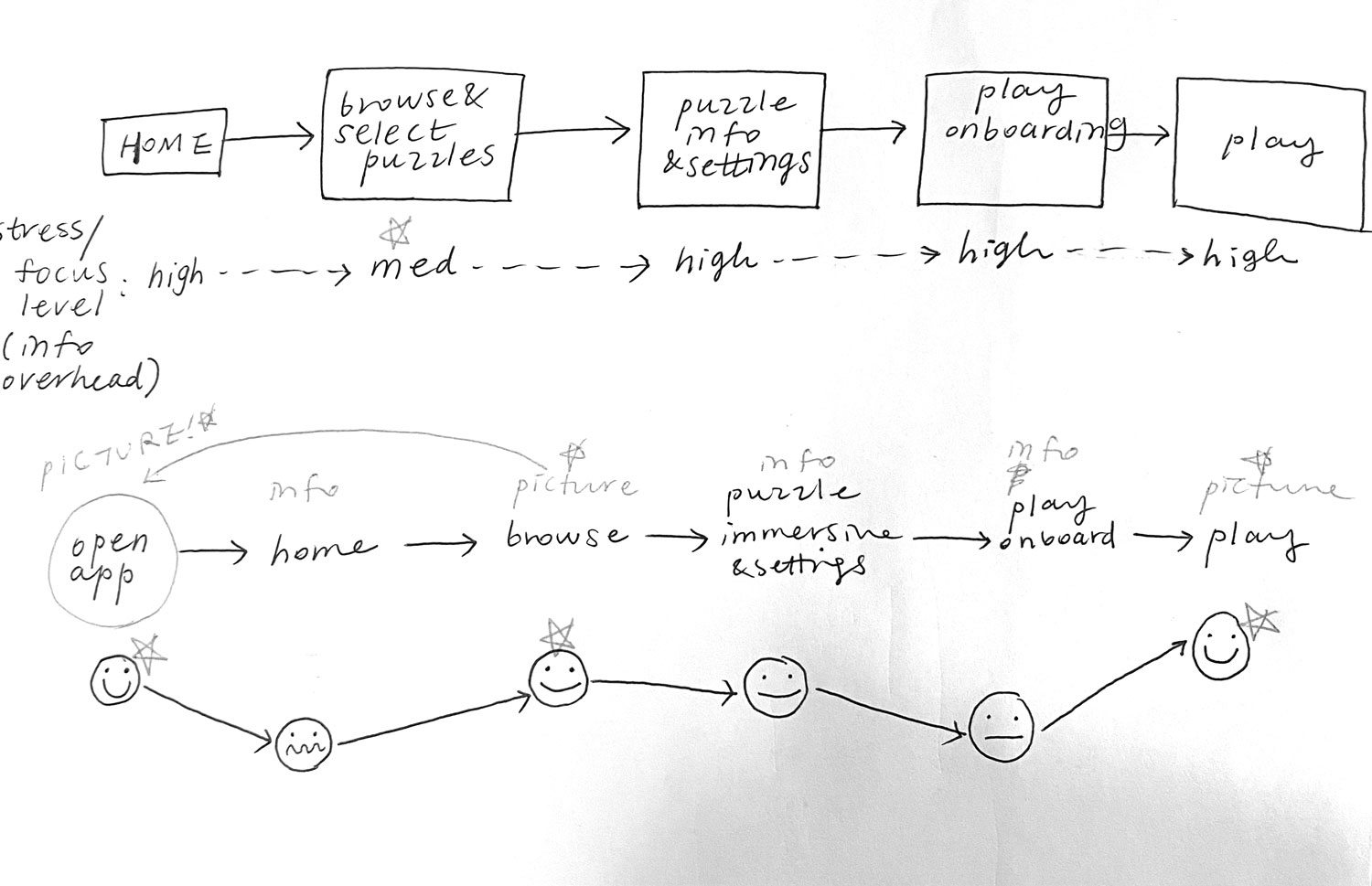
I identified parts of the main flow that required more focus on parsing information, as well as part that was more experiential. From this exercise I figured that:
*pending case study*
\ the home screen doesn't seem suitable to set the tone of the given product
\ pictures make users happier than words, as long as every screen serves a utility
\ the product is all about being welcoming—so welcome users!!
*pending case study*

——
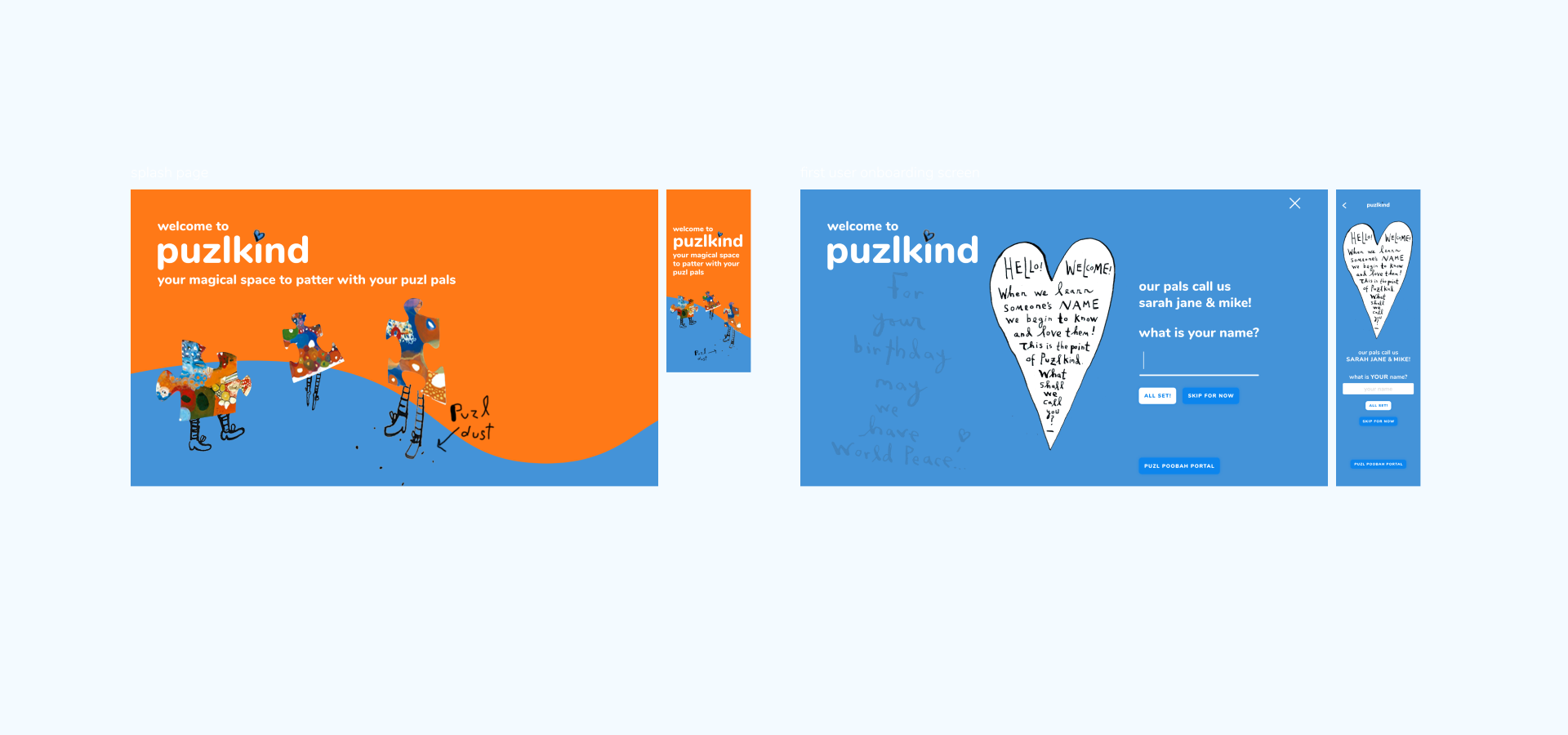
(top) Initial sketch of the onboarding sequence upon opening the app. A splash screen that sets the visual tone of the app is followed by a screen that asks the user if they'd like to set a screen name.
(bottom) Final visual direction combines the two steps.
*pending case study*
——
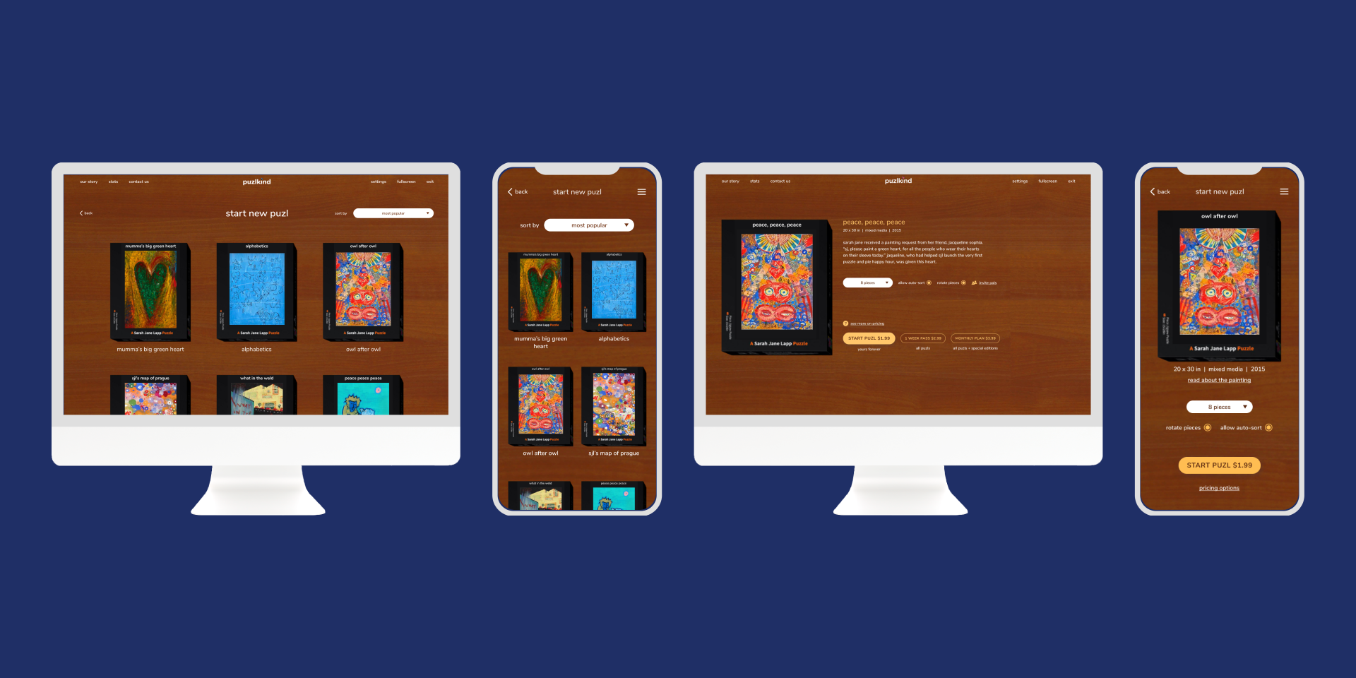
Final visual style applied to key screens
*pending case study*
rent the runway (coming soon)Project type
puzlkindProject type
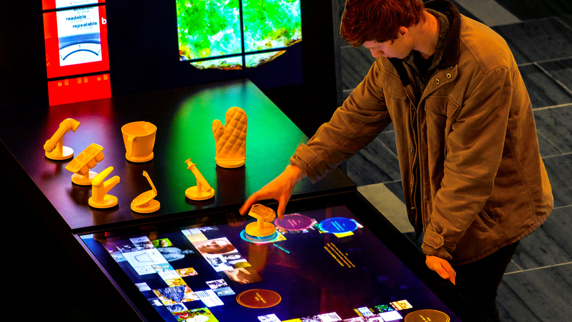
a window into NYULHProject type
an interactive library archiveProject type
ui ux exercises (pw protected)Project type
making science approachableProject type
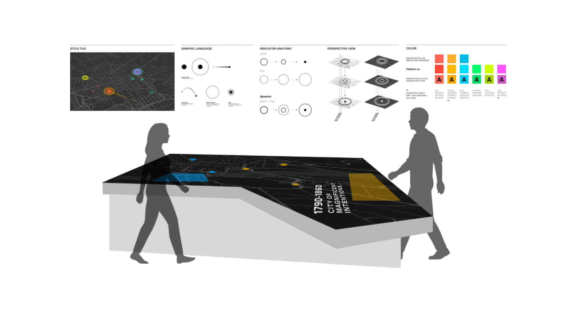
mapping the history of jewish washingtonProject type
more work snippetsgraphic \ motion \ web ui

thoughtsProject type